What’s Included — variant A against two image comps
You picked A over B as the clearer page and asked to see what image generation
would do with the same brief. Two comps, anchored to the site’s chosen comp as before.
My rating on each, as compositions.
Both comps invented a venue name again (“The Village Club”) and invented
inclusions (ceremony choices, candlelit ambiance, preferred partners). Ignore the words; comps are
scaffolding and never publish. Judge the composition only.
A — the ledger, as built
8 / 10
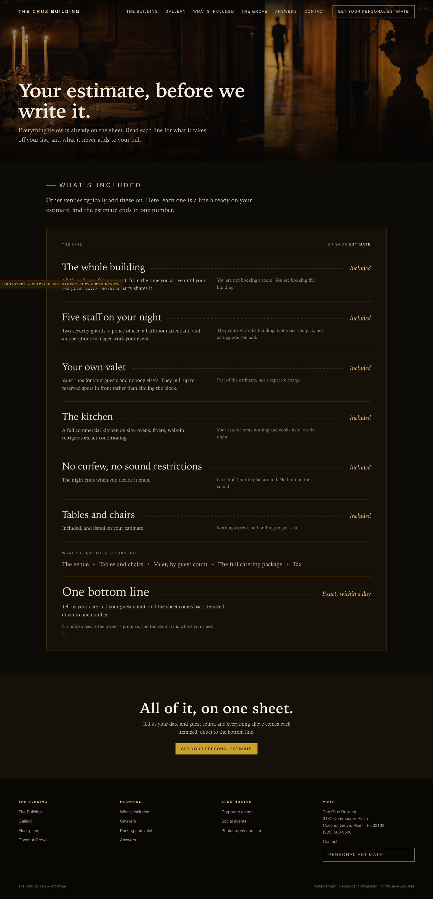
A working page in the site’s own system, verified at five window shapes.
It does the one thing neither comp does: it shows the estimate without showing a number,
and ends on the promise where a total would sit. Fewest words of the three.
Open A live
Comp 16 — seven ruled inclusions, no photograph
5 / 10
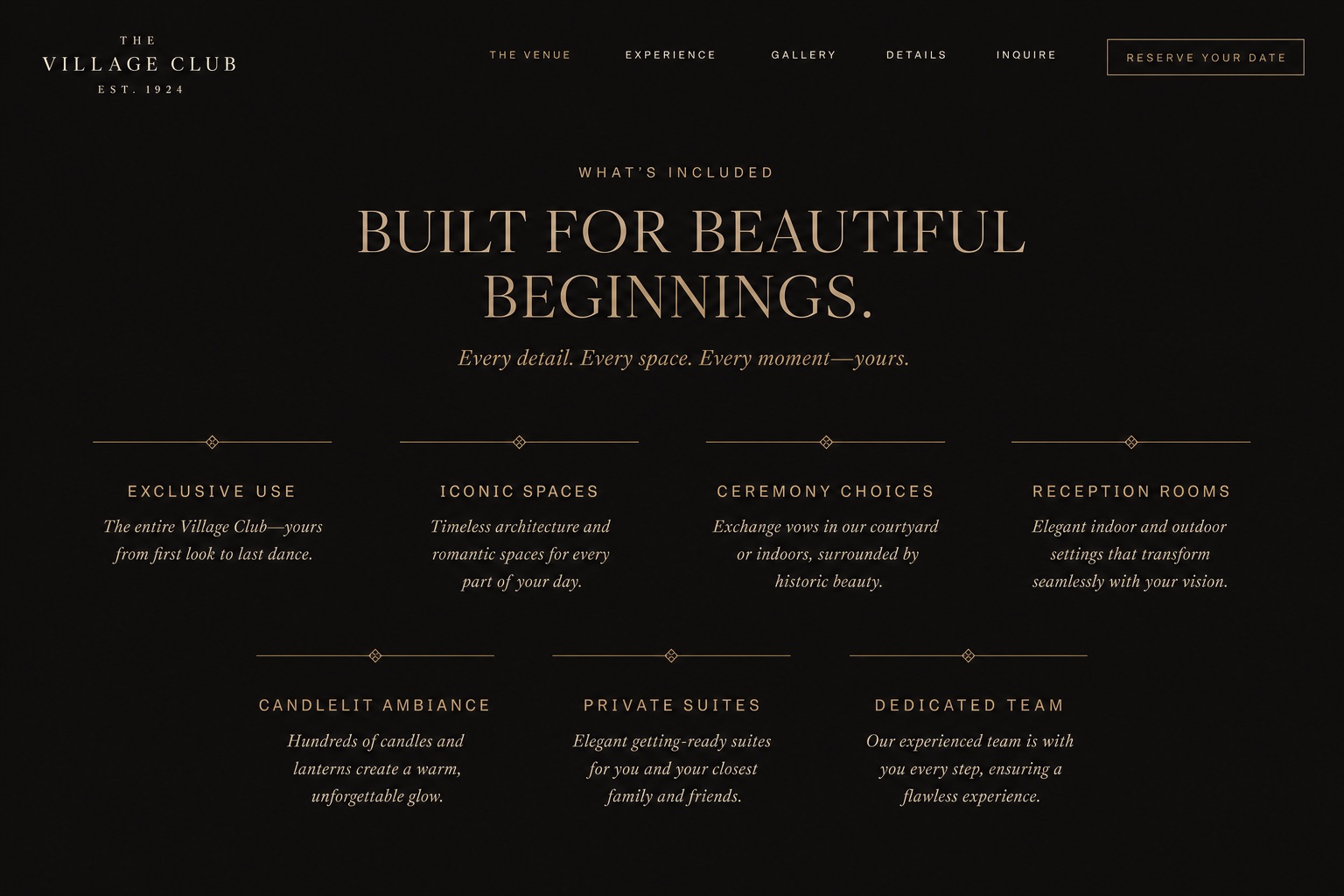
Handsome and generic. A centered all-caps headline and a seven-cell grid with
diamond rules is the home page’s inclusions screen again, dressed as every luxury
venue’s brochure. It says nothing the grid did not already say, and nothing about the
estimate. The all-caps display face is not the site’s.
Comp 17 — tall photograph beside seven entries
7 / 10
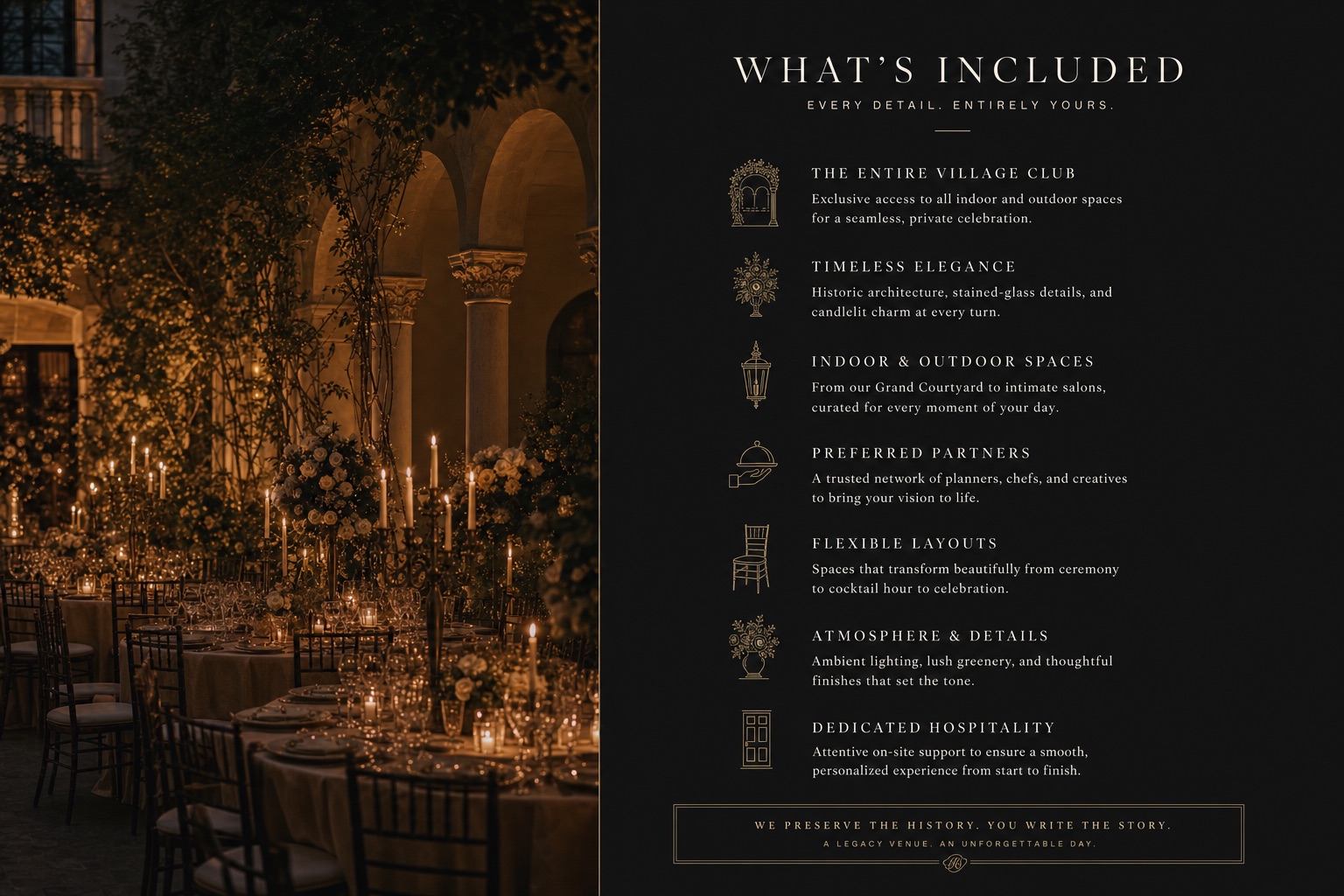
The stronger of the two as a composition: the photograph earns its half, the
entries read top to bottom, the framed line at the foot closes it. It would port cleanly. Two
costs: the line icons are a new device the site does not use anywhere, and the page would
still need a real photograph of the building to justify the left half. Still silent about the
estimate.
Spend: two outputs, $0.36, 34 of 40 and $5.85 of $10.00 used. Prompts verbatim in
comps/prompts.md (comp-16, comp-17).